Overview
XShield Tints built its reputation tinting cars. The owners wanted to grow into residential and commercial work, and both the brand and the digital presence were standing in the way. We grounded the project in deep research: an ethnographic study of the shop, interviews with five clients, and a participatory workshop with the owners. We shipped a full rebrand and a website built around how XShield's clients actually choose a tinting company. The business has since moved into the residential and commercial markets, and the engagement is ongoing.
The starting point
A tinting company known for cars faces a positioning problem: homeowners and business owners don't think of it for their windows. The brand said automotive, the customer base said automotive, and growth meant convincing two new audiences to trust a company they'd never considered. The question wasn't "make a website." It was: understand how three very different customers choose this kind of service, and meet them there.
The research
We ran three studies. First, an ethnographic study of the business itself: an in-depth interview with the owner, two full workdays of observation in the shop watching how work and communication actually flowed, and an analysis of the artifacts the business runs on, from messaging apps to social posts to photos of jobs. The analysis surfaced three problems. Bookings were scattered across phone, Instagram, and Facebook DMs, which made operations inefficient. The company had a steady automotive client base but almost no online reviews, a trust gap that blocked expansion into residential and commercial work. And its digital presence was too thin to reach the new markets at all.
Data collected
- Artifacts — Studied how the business uses technology and interacts with clients through messaging apps, social media posts, and videos.
- Photos — Collected photos showcasing the workplace environment and the type of work performed for both home and automotive services.
- Interviews — Conducted an in-depth interview with the participant and obtained a detailed script for analysis.
- Observations — Conducted workday observations to understand the participant's daily tasks and workflow.
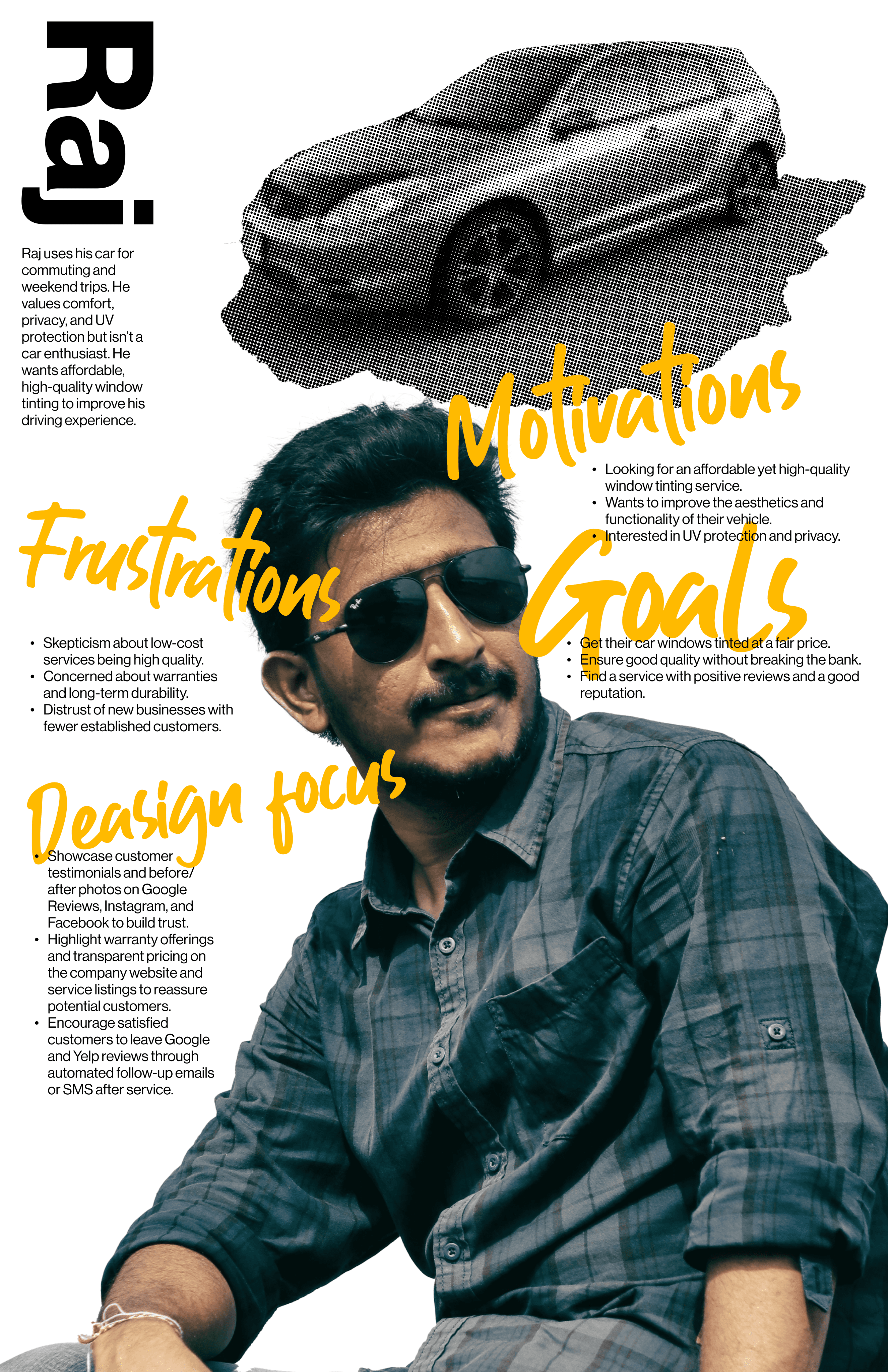
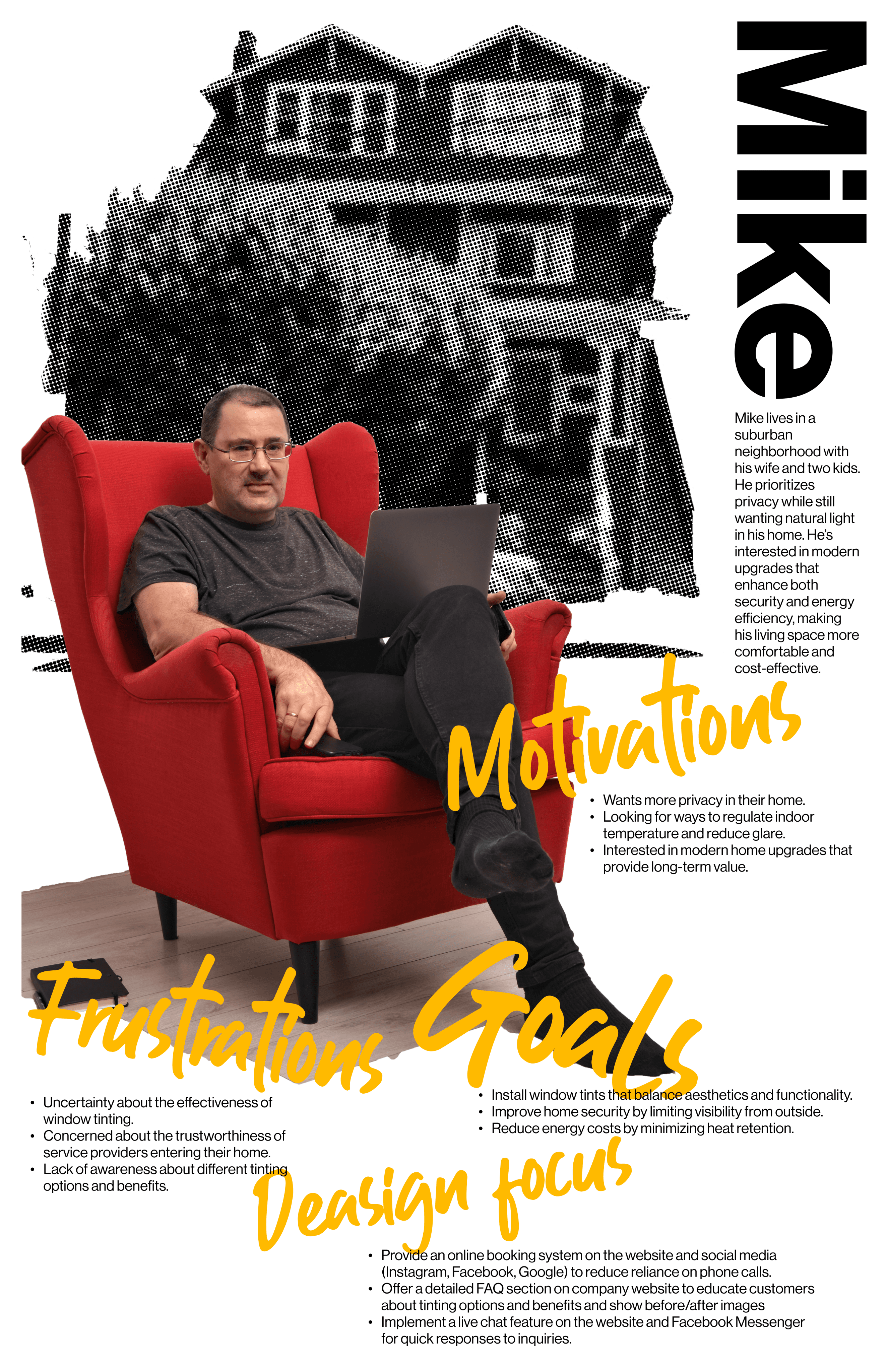
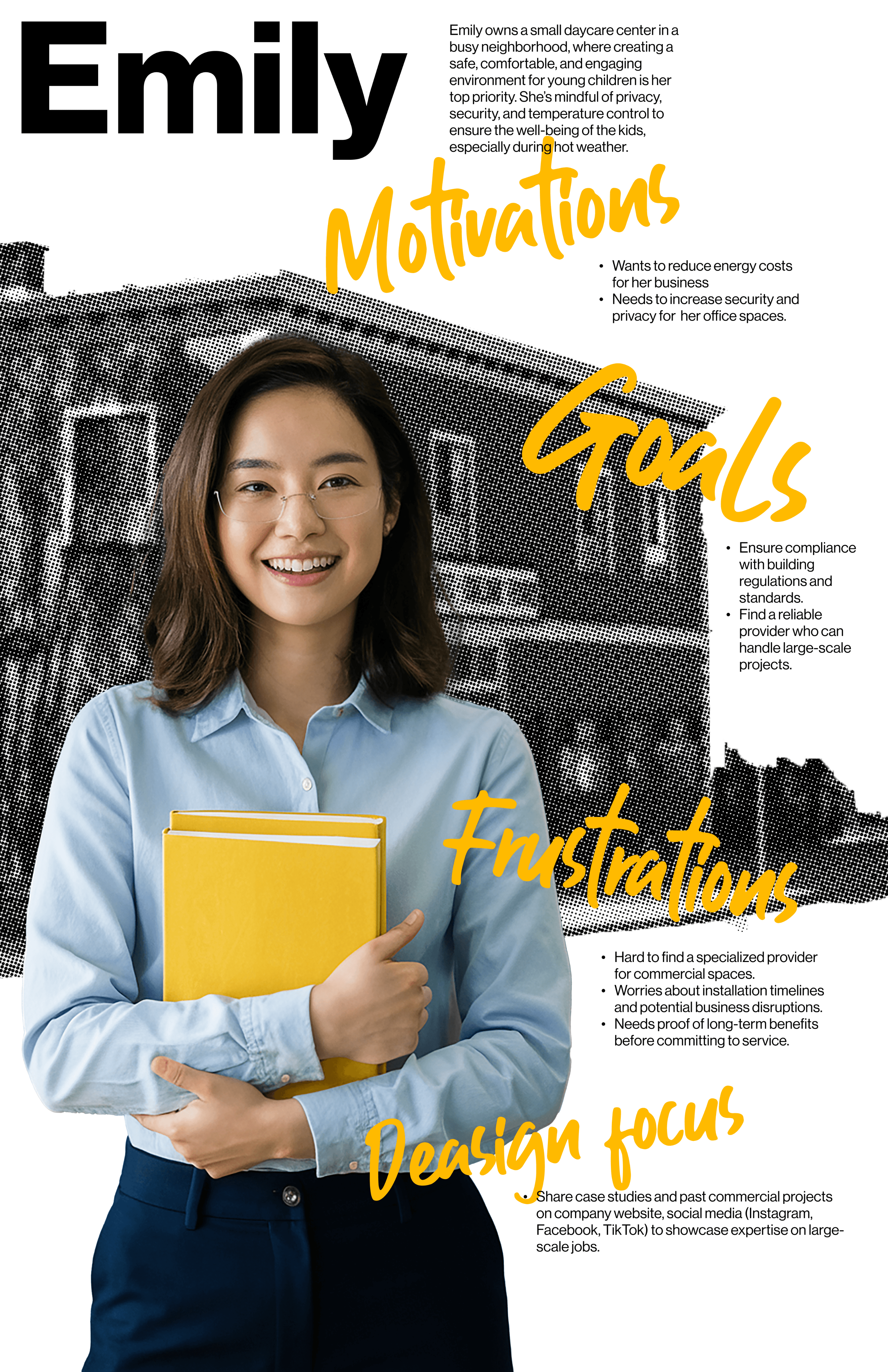
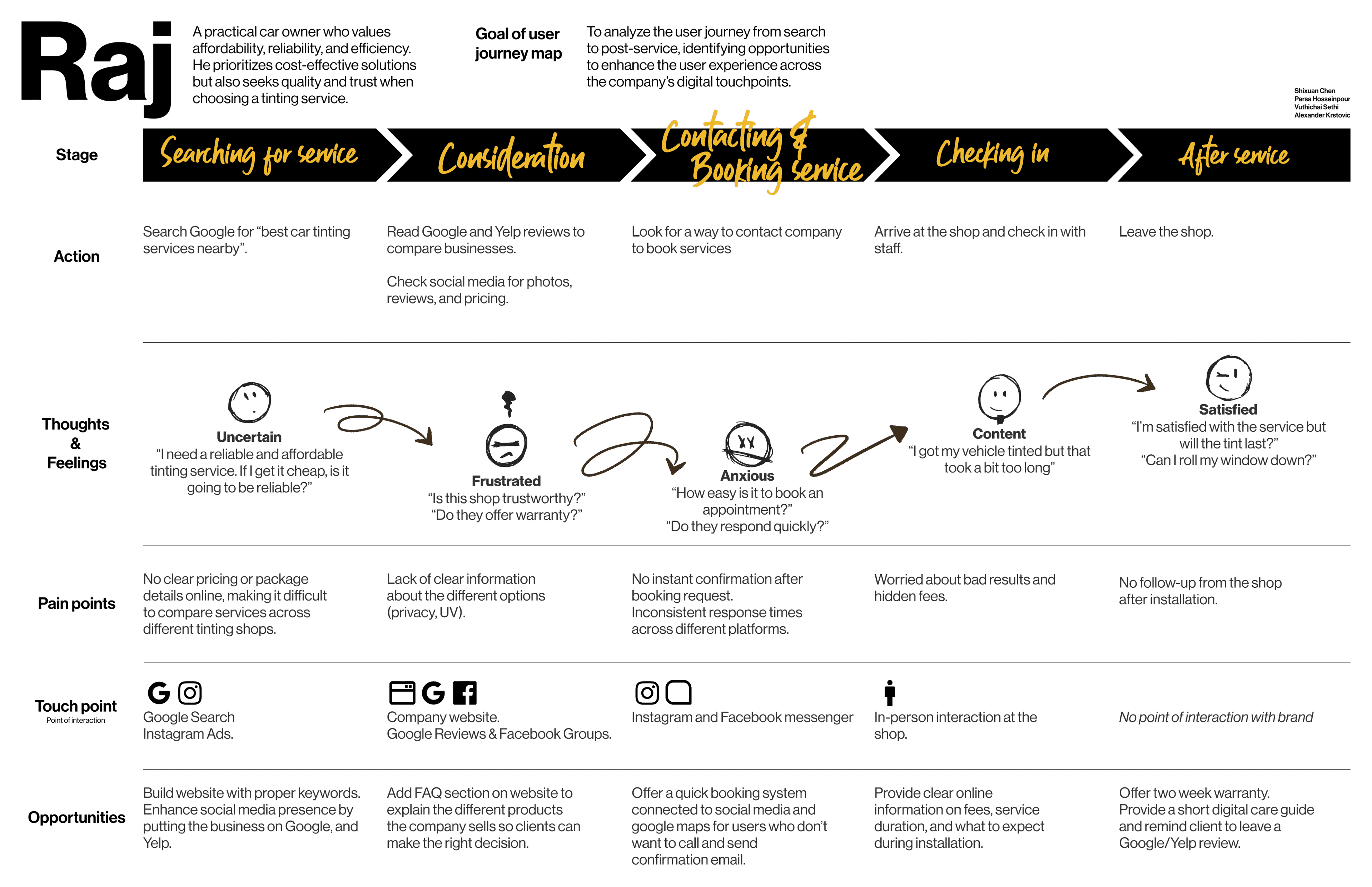
Second, we recruited five XShield clients for interviews about how they found, chose, and experienced the company. Those interviews are what the personas and journey maps are built from: three personas matching the three markets, a practical car owner, a privacy-minded homeowner, and a daycare owner responsible for a commercial space, and full journey maps from searching and comparing through booking, installation, and after-service, marking where the company had no touchpoint at all.
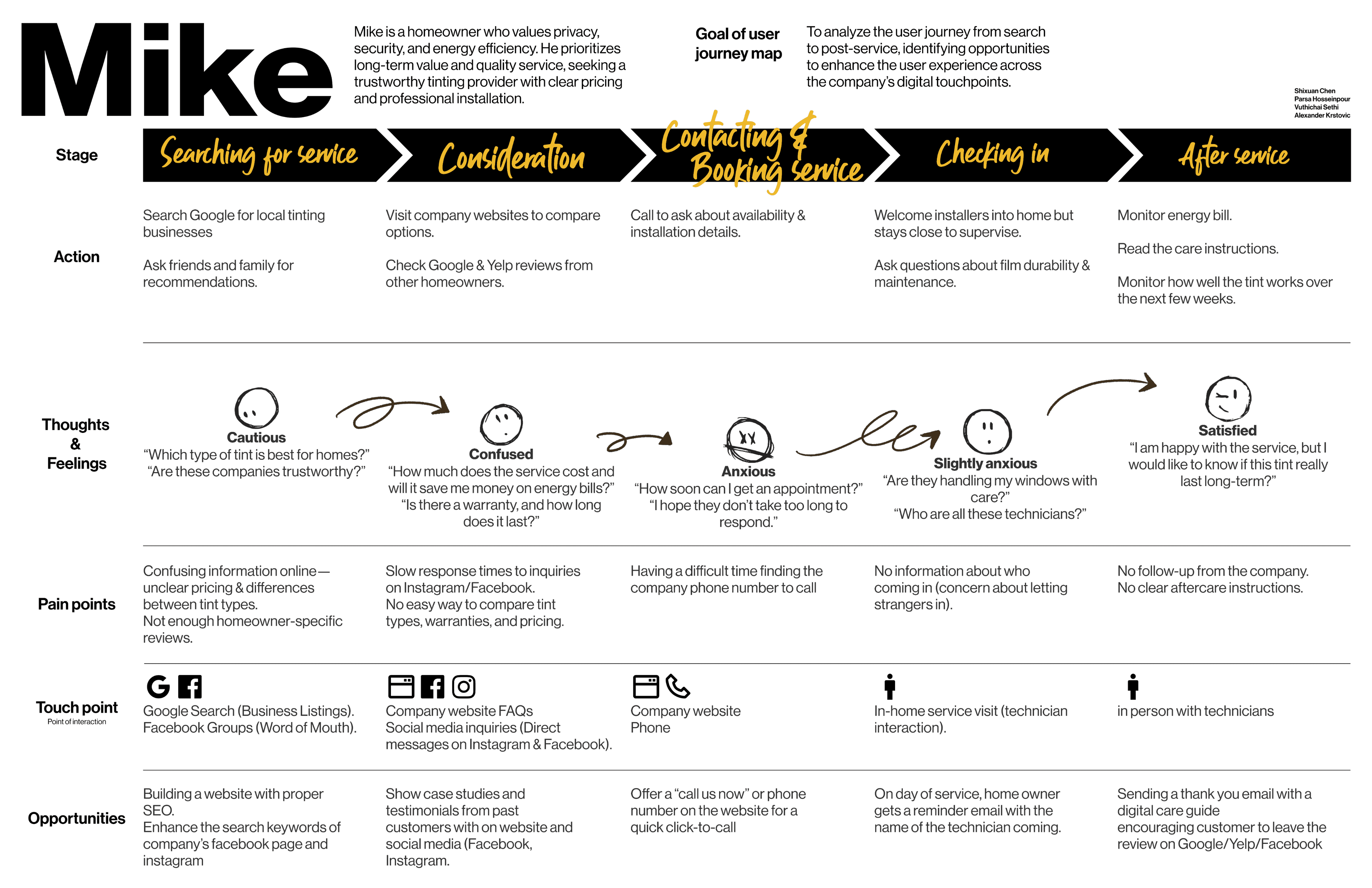
Third, a participatory workshop with the owner over Zoom and FigJam, structured as a funnel where each activity narrowed the focus: interview, empathy map, journey map, brainstorming, and an impact/effort matrix the owner used to weigh solutions himself. Putting the owner inside the research, rather than reporting to him afterward, meant the priorities that came out were ones he believed, because he'd helped build them.

The workshop put the owners inside the research: understanding what their clients' need, weighed against what the business could actually implement
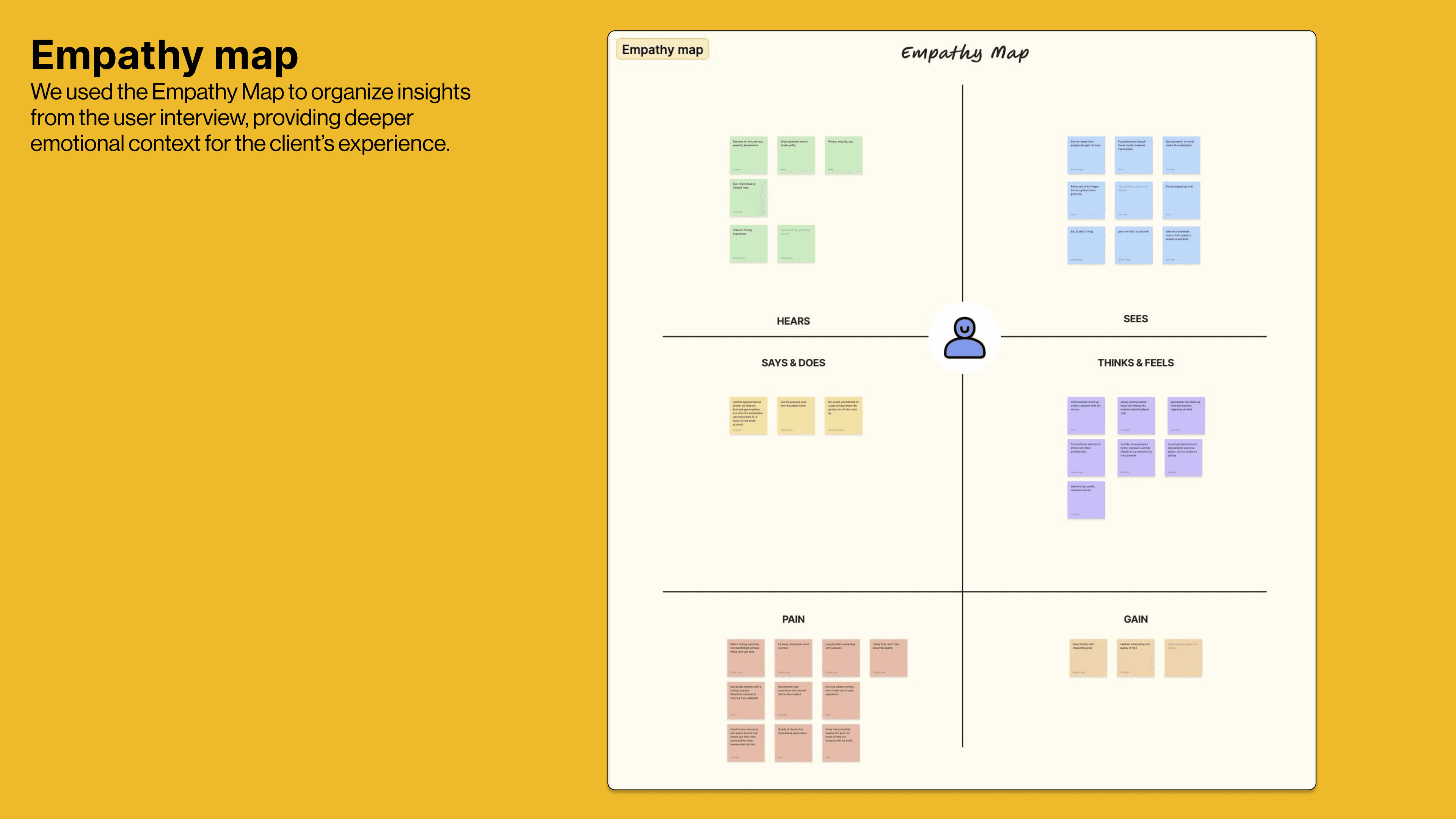
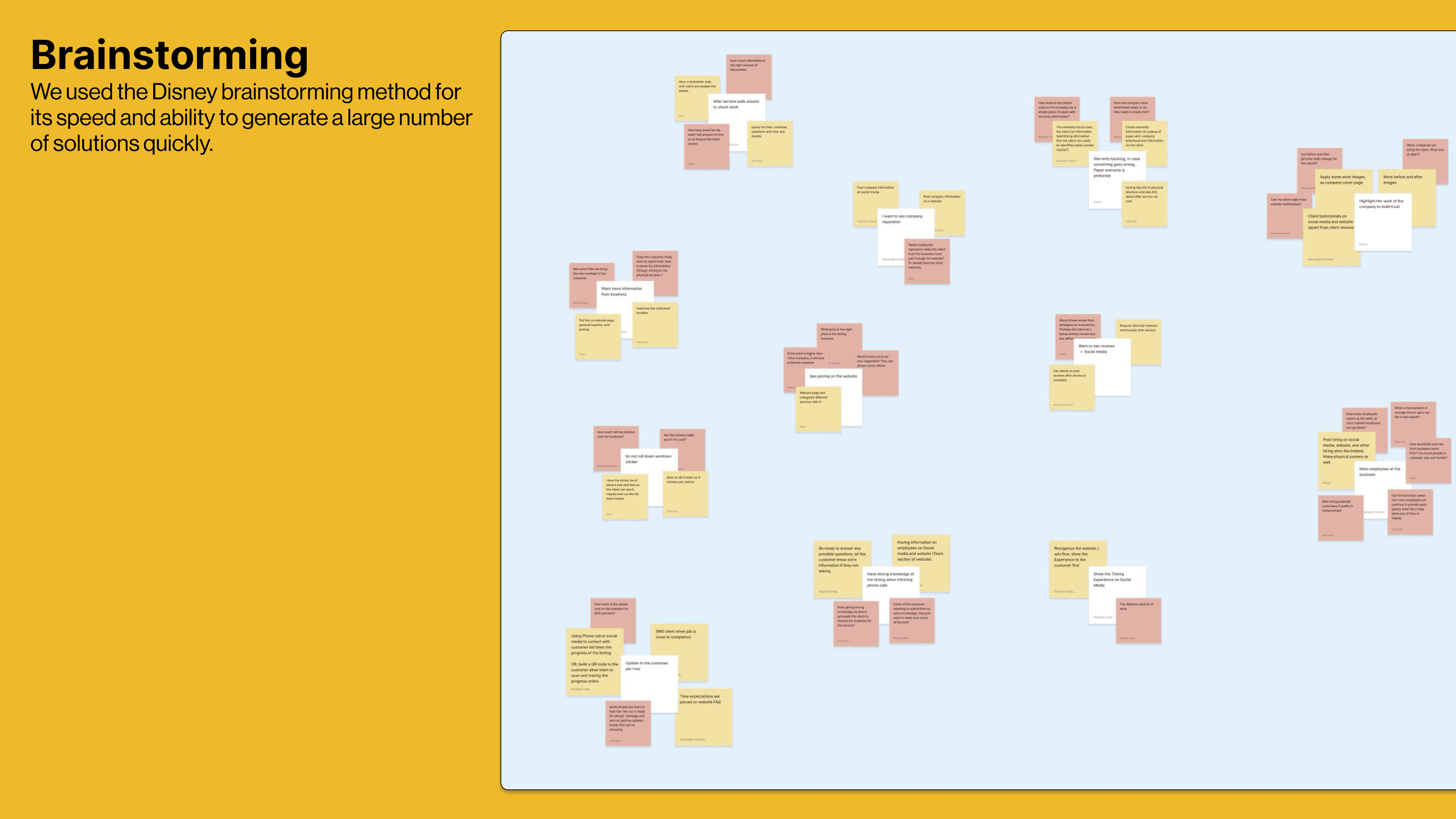
The business owners joined in creating the empathy map and generating ideas for their business through a brainstorming session
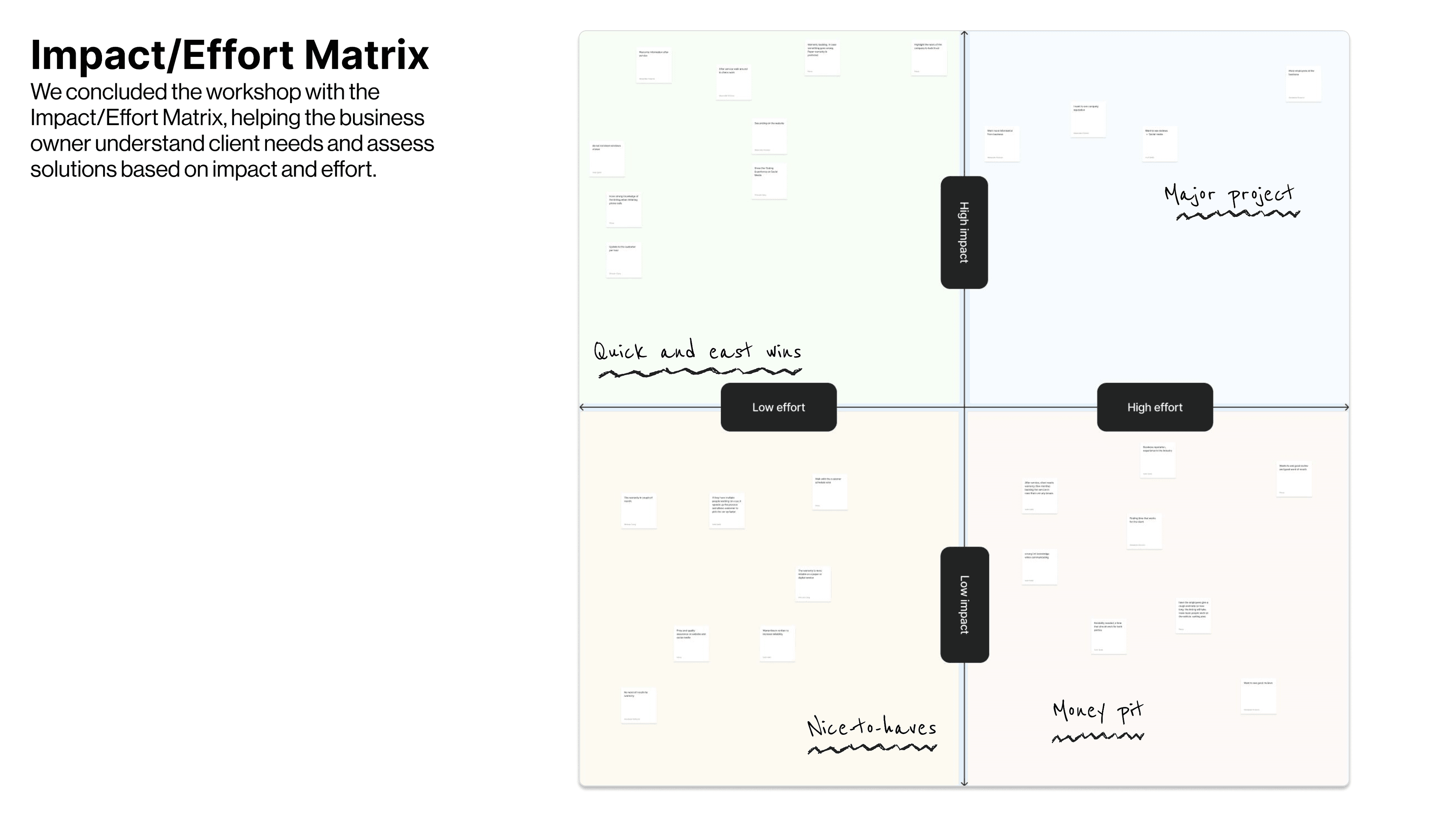
The workshop ended with an impact/effort matrix, so the owners could see every option and choose what served their customers and their budget
The two studies disagreed about the telephone, and that disagreement became the project's most important finding. From the business's side, the ethnography showed phone-based bookings were a burden: scattered, time-consuming, hard to manage. From the customers' side, the interviews showed the opposite: people want to call, because they want a human to answer their questions before they trust anyone with their car or home. The website was designed to serve both. Click-to-call is the primary action, and the FAQ and service information answer the routine questions upfront, so the calls that still happen are the ones both sides actually need.
From findings to a decision
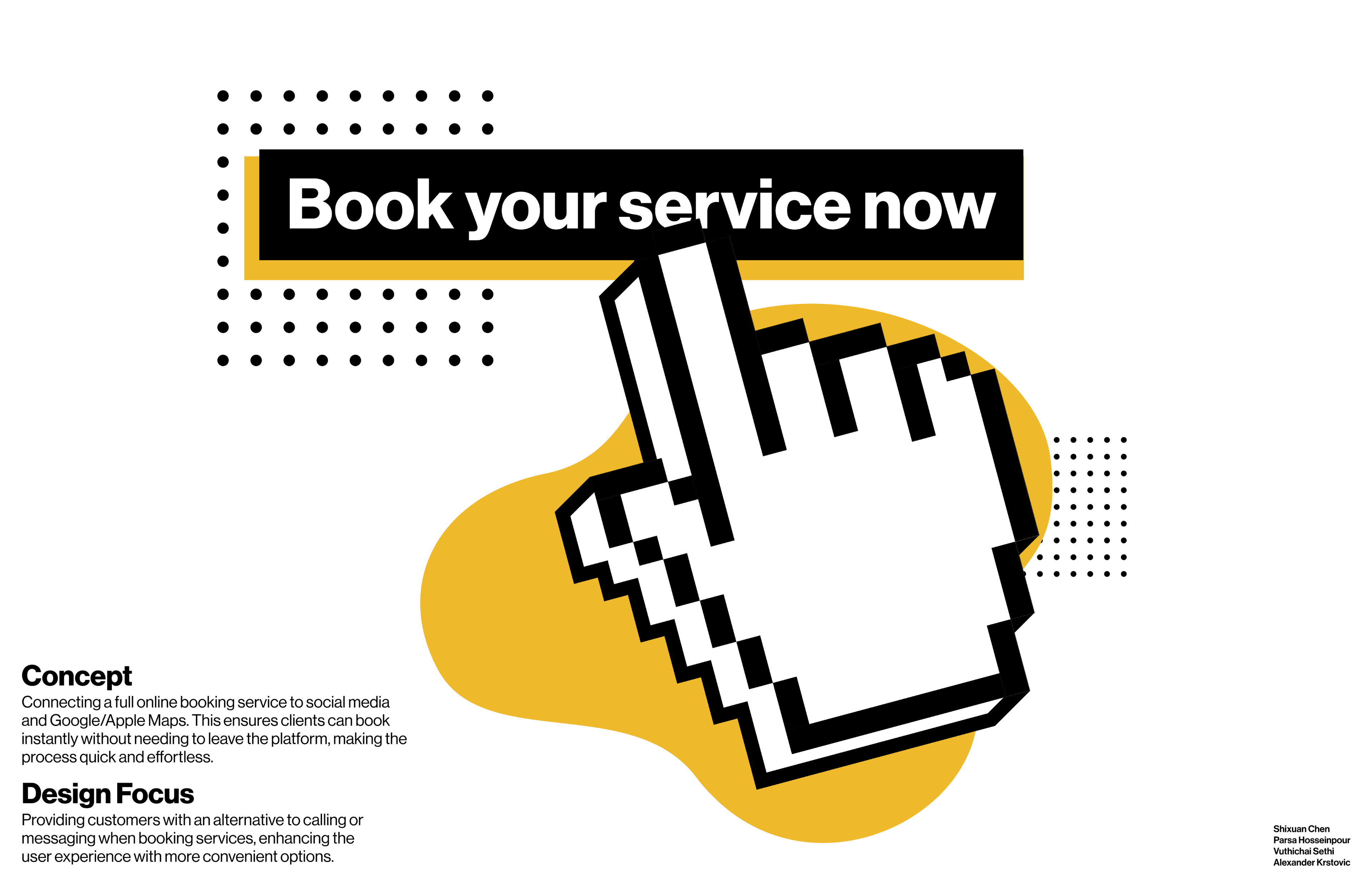
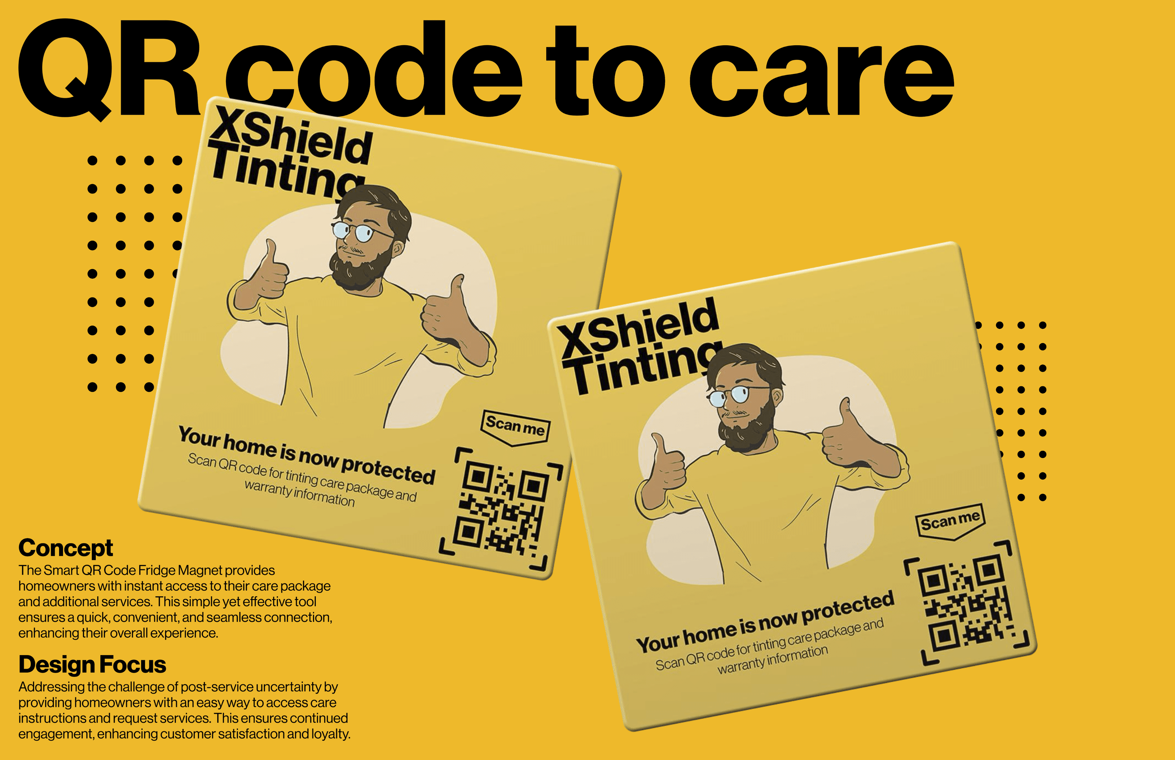
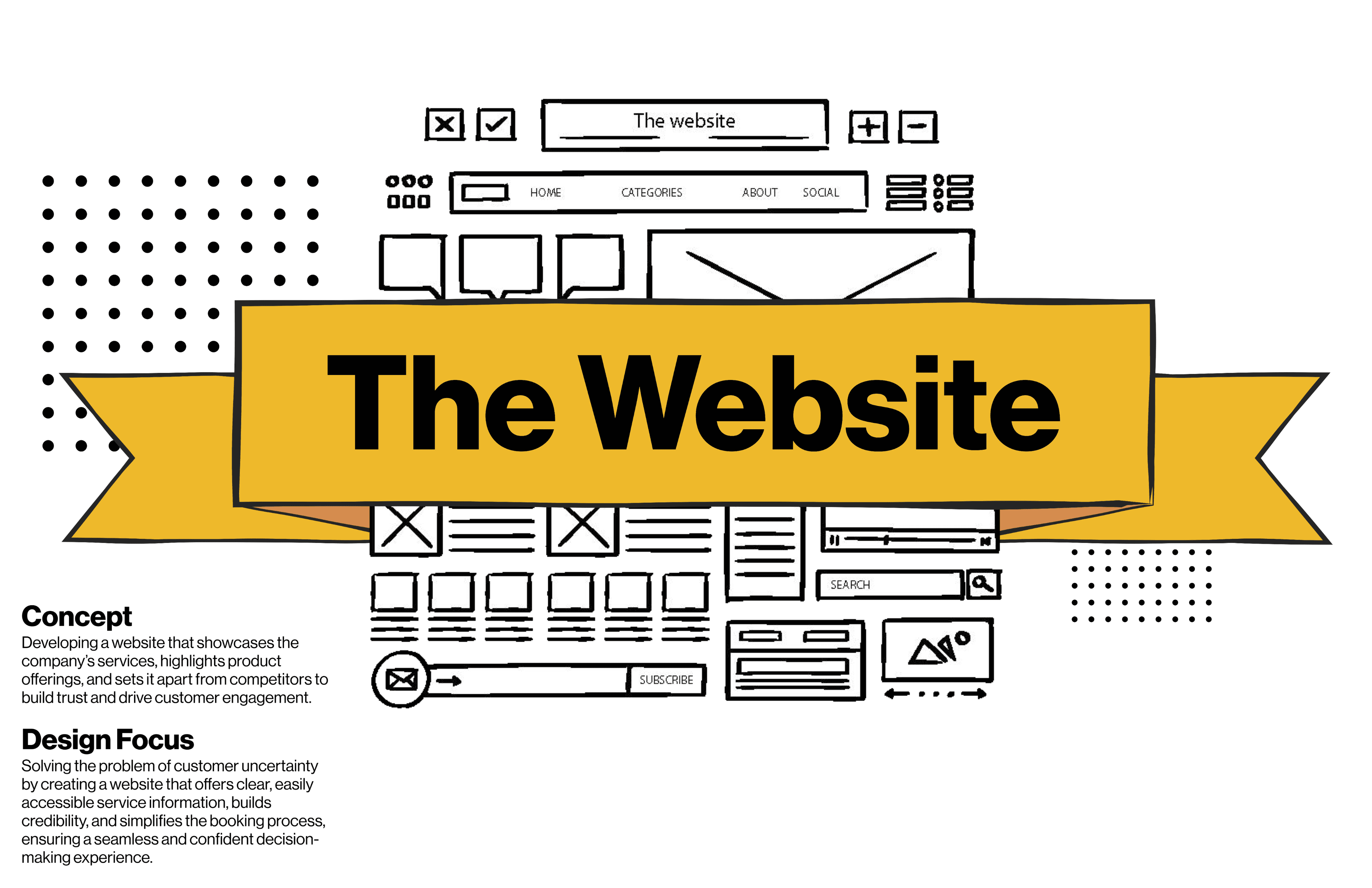
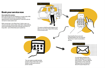
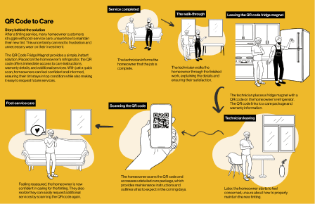
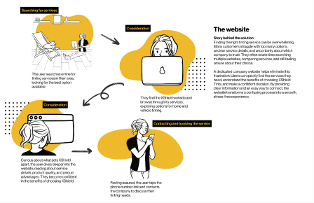
We developed three concepts and storyboarded each end to end: an online booking system, a QR-code-based after-care package, and a dedicated company website. Weighed on the impact/effort matrix with the owner, the website won: highest impact for a small business, and the one concept that worked with the behaviour our research found, putting clear service information, trust signals, and a click-to-call path in front of all three customer segments.
The rebrand
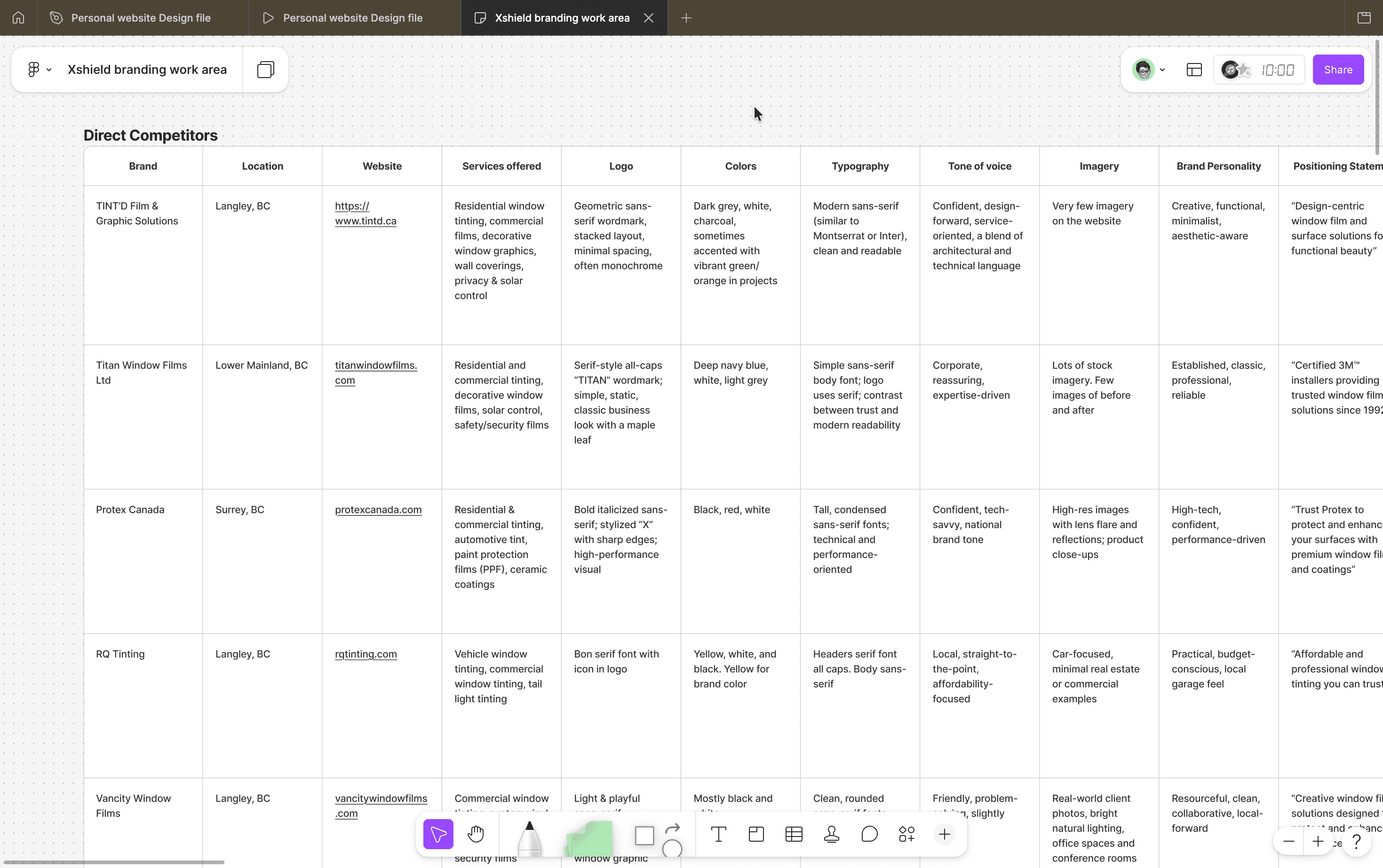
The website couldn't do its job wearing the old identity. A brand built around cars doesn't reassure a homeowner or a daycare owner, and the trust gap the ethnography found had to be closed at the identity level before any webpage could close it. So the work started one level down: the brand. I mapped the competitive landscape first: eight direct competitors across Surrey, Langley, and the Lower Mainland, plus indirect players like Budget Blinds and Hunter Douglas, analyzed across logo, color, typography, tone of voice, imagery, and positioning. The market split into two camps, corporate-technical brands leaning on certifications and budget-local shops leaning on price. Neither spoke to all three of our customer segments at once, and that gap became the brief.
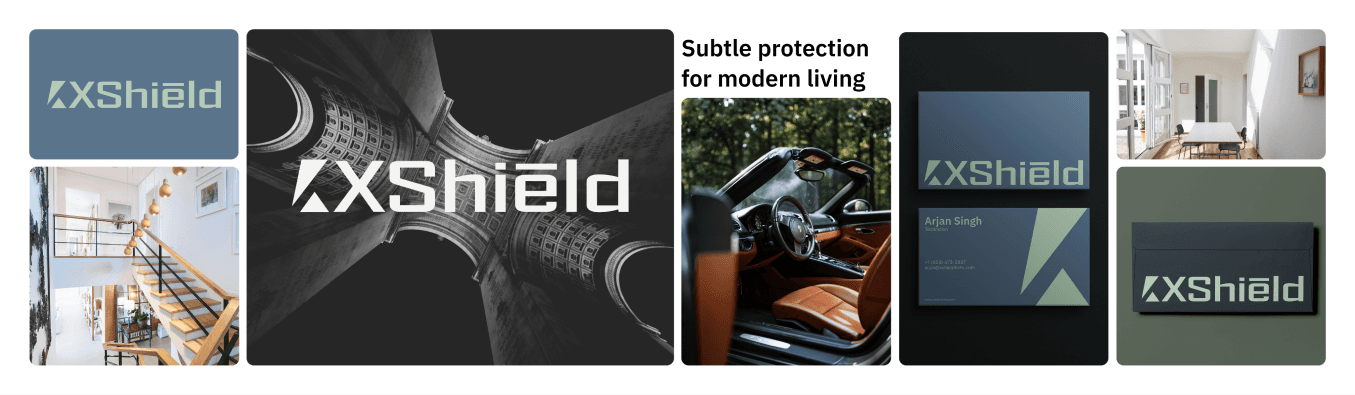
I designed three brand directions, each a different answer to it: a bold, tough identity built on protection; a warm, local, people-first identity; and a refined, modern identity aimed at property owners. Each direction came as a full system: logo, palette, typography, and mockups across real touchpoints, from business cards and technician badges to signage, so the client was choosing between futures for his company, not between logos. He chose the refined, modern direction. The move into residential and commercial work was a move toward higher-value clients, and this was the identity that could stand in those spaces. From there I built the final identity and the brand guidelines that keep it consistent everywhere the company shows up.
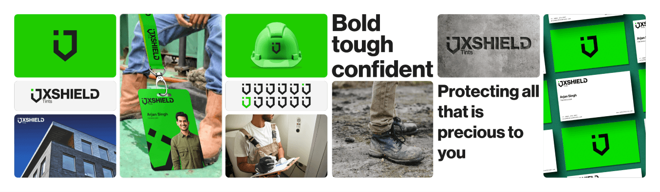
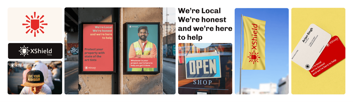
The three design concepts helped pave the way to the final product design, which is the website
The website
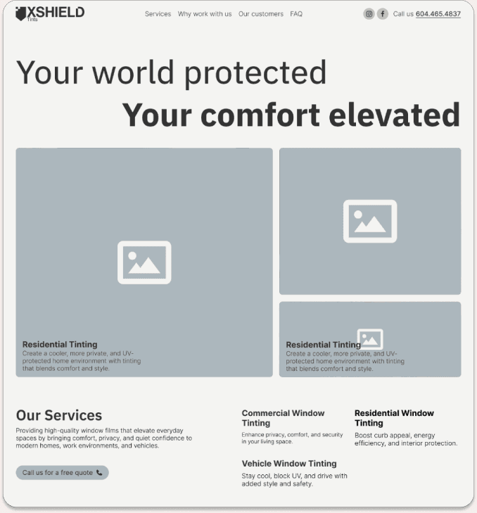
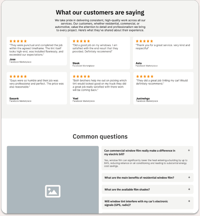
The site is the research made concrete. Services are organized around the three markets, and the ordering is deliberate: residential and commercial lead, because repositioning was the point. Trust does the heavy lifting throughout. A transparent, written warranty is the first thing the site promises, straight from the finding that customers want something tangible to hold onto. Real customer reviews, gathered from where they actually lived on Facebook Marketplace, answer the trust gap the ethnography exposed. An FAQ handles the questions customers otherwise call to ask, so the primary action, click-to-call, connects people who are ready to talk with a business that isn't buried in avoidable calls. It's built on a CMS so the owners maintain it themselves.
Team members
Alexander Krstovic
Shixuan Chen
Parsa Hosseinpour
Vuthichai Sethi